

Brand assets and guidelines
Use assets and guidelines to represent Cal.com consistently across all platforms and touchpoints.
Logo
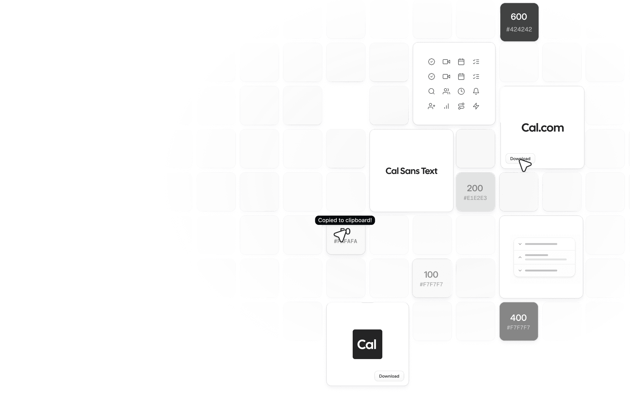
The Cal.com logo should be used in all references to Cal.com as space allows.
Icon
For tight layouts or logo-only grids, the Cal.com icon is a concise way to refer to Cal.com. It also serves as the favicon.
Colors
The Cal.com color palette is a precise suite of flat gray tones. Use these colors consistently across all brand materials.
Typography
Our primary typeface is Cal Sans by Mark Davis. It’s a geometric sans serif for tough use cases. It retains its appeal up close, with letters always looking the way users expect. It’s a uniquely warm choice for digital product and running copy. It has more bounce per ounce, but still feels transparent, neutral, and un-opinionated.
Our secondary type is Cal Sans UI.
Iconography
We use the Lucide icon set. Lucide is a fully open source icon set containing 1,701 icons.
UI icons have a simple line form and express essential functionality.
coss.com UI
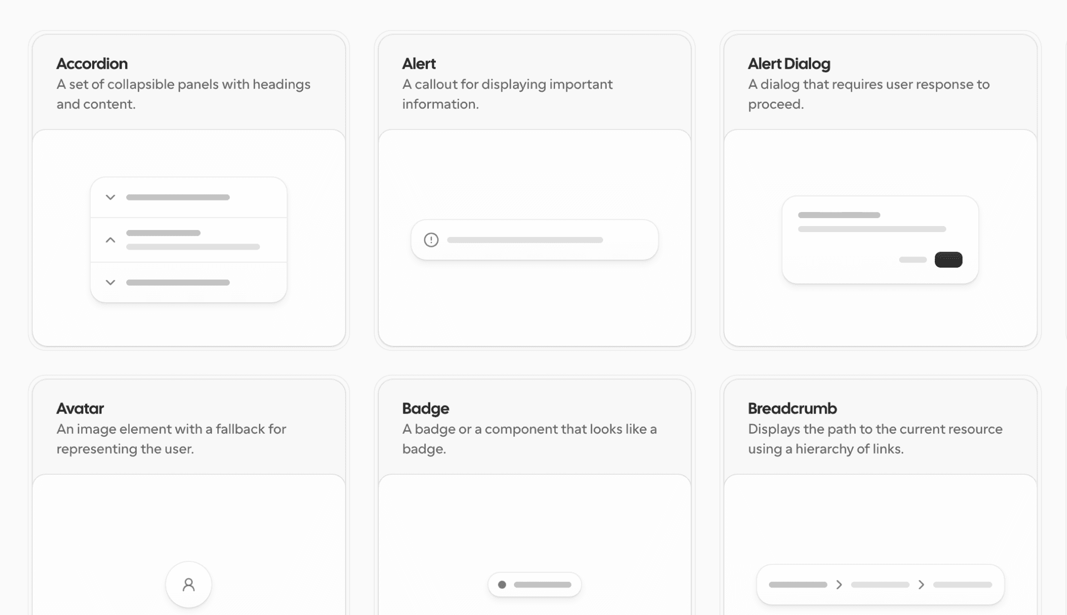
A new, modern UI component library built on top of Base UI. The building blocks for the Cal.com application and the wider coss.com platform.